
FC Barcelona promotes women’s empowerment with its away kit
FC Barcelona presents its away kit for the 2021/22 season with a design that promotes women’s empowerment. Thus, it opts for purple — a fusion of blue and red, which commonly represents the fight for gender equality. The design, however, still incorporates the traditional Barça stripes on both sides. To reinforce the Club’s commitment to women’s sports, Barça adapted the originally masculine phrase of the Club’s anthem ‘Tots units fem força’ (United we are strong) and stamped the feminine version on the side of the jersey.

Fans will be able to find the new jersey exclusively from July 15 to July 20 at the Barça Store and the Club's e-commerce, before going on full retail.
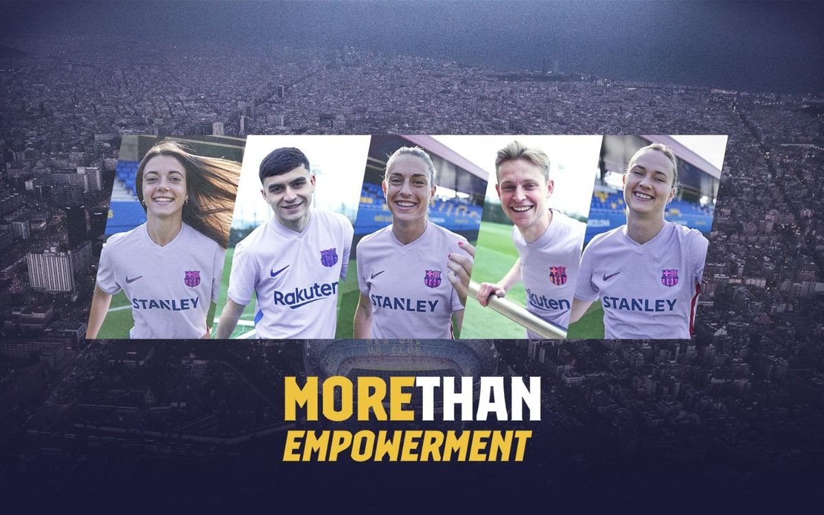
The new away kit is presented under the ‘MORE THAN’ campaign, promoted by the Club this season, which includes the pillars that make Barça a unique entity around the world. The design of the jersey is framed under one of these pillars, ‘More than empowerment’, which highlights FC Barcelona’s commitment to women’s football and the role of women in sport.
A commitment that this year celebrates a very important milestone, as it commemorates the 50th anniversary of the game played on December 25, 1970 at the Camp Nou by the women’s team Selecció Ciutat de Barcelona, considered the origin of Barça women’s football set up. To celebrate that milestone, a few of those pioneers who played at the Stadium have been incorporated into the campaign to launch the new kit together with Barça Women’s players Aitana Bonmatí, Jennifer Hermoso, Marta Torrejón, Alexia Putellas and Caroline Graham Hansen.
More than a jersey
The new kit adopts purple as the main color and, for the first time, does so in an almost pastel hue, as in the 2016/17 season purple was also used, but in a much darker hue.
This year, it is also opting for purple for details such as the crest, which has an iridescent effect, logos, numbers and the name at the back. A pattern that only breaks with the addition of a blue vertical stripe on the left side and a garnet vertical stripe on the right side. And this is where the reference to the anthem that represents all the Culers, known as ‘Cant del Barça’, has been incorporated. Here the sentence ‘Tots units fem força’, translated ‘United we are strong’, is included, but the peculiarity is that while on one side the original phrase has been retained, on the other it has been adapted to the feminine version. Also, the lower edge incorporates a layout with the colours of the rainbow flag, which symbolize diversity.
The kit is completed by shorts, also in purple and with a blue and garnet stripe on the sides, and socks in the same colour, where the CULERS lettering and the Nike logo in the middle stand out. The away kit will be marketed with the logo of Rakuten, the Main Partner of the men's team at the front, and with the logo of STANLEY, Main Partner of the women's team.
Sustainability, a key factor
Along with Nike, the Club has also maintained its commitment to sustainability on this occasion. Therefore, 100% recycled polyester has been used to produce the equipment, obtained from recycled plastic bottles that are melted to obtain a very fine thread. In this way, a fabric is obtained that allows maximum performance in sports and has a minimal impact on the environment.